Patticha Visuals
Pictures mean a thousand words and can last a lifetime. Helping people document and share their monumental moments is what photographer and business-owner Patty Vitsupakorn is all about.
For this project, I redesigned my client’s website so the experience is responsive, content is updated, and pertinent information is present in order to focus on the business’ photography offerings and increase bookings.
Goal: Create a responsive website and refresh branding for client
Role:
UX Researcher
UX/UI Designer
Project Duration: 65 hours
Tools: Figma (for design), Google Docs and Google Sheets (for research and interviews)
Constraints:
Creating deliverables within set timeline
Satisfying client while also meeting user needs

Background
As a multi-hyphenate, Patty’s original site served as a portfolio for all of her creative pursuits making it difficult for herself and customers to gauge what it is her business does and what sets her apart from the competition.
My research and design work served as the foundation for refreshing her branding, repositioning herself amongst a saturated market, and refocusing her core offerings to align with her goals as well as her target consumers’ goals to ultimately produce a responsive website.
Research
Discover
Research Goal
The goal is to learn what people look for when it comes to choosing a photographer for their special occasion so that we can create a responsive website that provides people with the information they need in order to book the service with confidence and that fits them best - in turn improving their overall experience.
Research Methods
Secondary Research: Competitive SWOT Analysis
Observe and understand what other competitors are currently doing in this space
Strengths, weaknesses, opportunities, threats, core competencies, demographic, and product features
Competitive SWOT Analysis
Key Takeaways
There were a myriad of fellow local photographers with similar artistic styles making them almost interchangeable. All of them offered primarily engagement/wedding photography as well as other portrait types like graduation, family/maternity, professional headshots, etc.
-
Pricing
Expertise/experience level
Personality
-
Photography content was showcased in a multitude of ways (by client, by portrait type, or misc.)
There were pages dedicated commonly to work, pricing, about, contact, and FAQs
All competitors featured client testimonials
Pricing information was often hard to find and/or required reaching out to photographer or filling out a form
Primary Research: User Interviews
Conducted remote interviews with people who:
have looked for a photographer in Washington D.C., Maryland, and/or Virginia
have booked a photographer in Washington D.C., Maryland, and/or Virginia
Heard users’ first-hand stories about their running journeys and in turn – better comprehend their motivations, preferences, feelings, experiences, and challenges
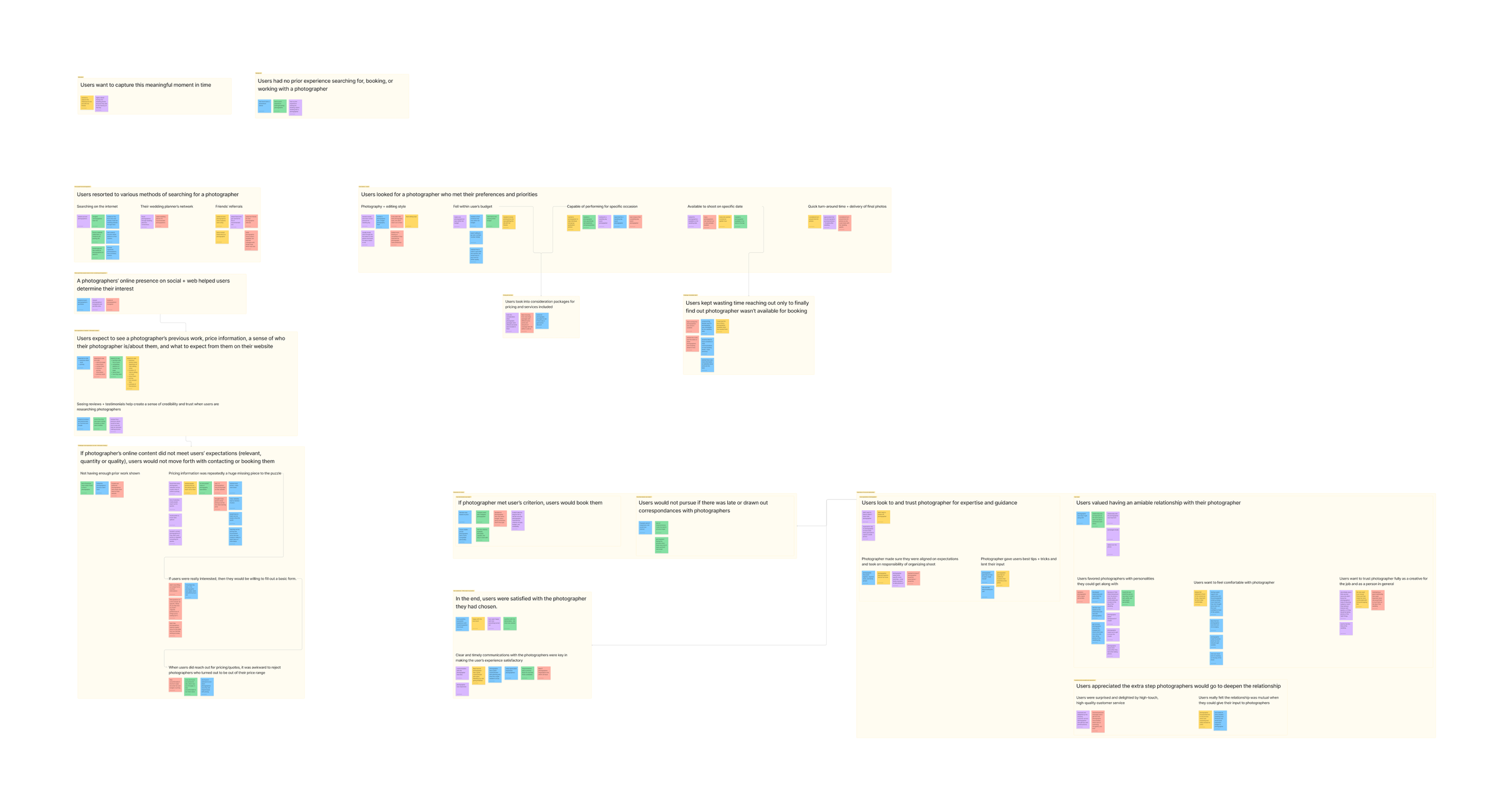
Synthesized interviews through affinity mapping, noting any patterns and reoccurring sentiments, and deriving insights to inform problem definition and problem solving.
Key Takeaways
With these findings, it becomes apparent what pieces of information are needed by users in order to make a decision from a photographer’s website that best suits their interests and how to make the experience both online and upon performing services successful for the user.
-
People seek out photographers because…
Want to capture special occasion
Keen on aesthetics matching personal taste from the table linens to the music playing to the event photos
Prefer to stay within allocated budget
-
Finding photographers’ pricing was a common challenge for users
Photographers not showing any or minimal pricing information
Sticker shock when they do find out + have to turn them down
Time + effort to research and respond to candidates
Unavailability of candidates on desired set date
Photographers not showing enough of their previous client work
-
Common factors for choosing a photographer
Pricing
Aesthetic/photography style
Availability
Services/packages offered
Turn-around time for deliverables
Location
Users value a positive relationship with their photographer
Photographer is personable and made them feel comfortable
Photographer is responsive and communicative
Photographer is an expert in their craft
Sense of trust
Time for research and correspondence
Perceived value added for each cost incurred
Ample amount of information to make decision
Price
Services
Packages
Affinity Map
Research
Define
Who is the User?
Two distinct personas developed from research synthesis.
Taking all learnings from user interviews and boiling that down into a characterization of who the user is. This helps ground me in a narrative to fully understand and empathize with the user and provide a framework for what potential solution can remedy them.
Personas
What is the Problem?
Finding readily available talent that are compatible with users’ preferences/needs
Obtaining and demystifying photography pricing information
“How Might We” Solve the Problem?
Coming up with and posing “How might we?” questions based off of insights, needs, and POV statements to ideate potential solutions for users.
How might we help users find readily available talent that are compatible with their personalities and/or meet their preferences, like visual aesthetic, in a timely manner?
How might we help users obtain and demystify photography pricing information?
“How Might We” Statements
What is the Solution?
A content-first approach in designing a responsive website. Through the intentional use of copy, photos, information hierarchy, and other design choices - information is communicated in both direct and subliminal ways.
Once the previous was determined, it was time to lay out the groundwork for the website: how it will be structured, how users will navigate their way through it, and how it will look.
Project Goals
Where the business and users can be satisfied and what is technologically attainable
Feature Road Map
Prioritizing what product features are essential for an MVP
User Flows
Defining key tasks users will perform in order to reach their goal and what that corresponds to in the MVP’s architecture
Key Tasks
Booking a photographer
Inquiring additional service and pricing information
Design
Develop
UI & Branding
Patty’s photography style was already clear and consistent: warm, natural lighting with candid movements that are not too posed.
Based upon my research and talks with my client, I knew storytelling was important in conveying her artistic style, what photography means to her and her clients, and breaking the mold of what her competitors were doing. So, going with a content-first approach, I really wanted to utilize the gold mine of photography content she already had and prioritize them in the designs.
In terms of what my client wanted her business to evoke, she wanted the branding to be modern, sophisticated, and clean.
Moodboard
Style Tile
HiFi Wireframes | Desktop
With a strong foundation established, it was time to start building the prototype starting with creating key screens based off of the main user flows (inquiring additional service and pricing information and booking a photographer). Desktop was prioritized as users typically perform these tasks from their computer, as noted by the client and through user interviews.
Flow 1: Booking a Photographer
Flow 2: Inquiring Additional Service and Pricing Information
HiFi Wireframes | Mobile
Due to time limitations and based upon user behaviors, a few key screens were developed for mobile view. These screens were used as a basis for first impressions of the business’ website in terms of aesthetics.
Design
Test
Usability Testing | HiFi Wireframes
To make sure designs were on the right track, remote usability testing was conducted on the low-fidelity wireframes in order to:
Gauge user’s first impressions of the website and what their takeaways are about the business, owner, etc.
Evaluate ease of use, efficiency, and overall experience
Identify pain points and challenges users face when navigating screens/through task flows
Learn what changes can be made to improve user experience
Results & Feedback
Average ease of Task 1: 9.7
Average ease of Task 2: 8.9
Average overall satisfaction: 9.6
*Rated on scale of 1 to 10
All participants were able to complete all tasks with little to no errors. As reflected in the average rating, he second task (inquiring more information) was more difficult for users since it required more effort on their end. Users had positive experiences overall.
Suggestions for improvement:
Add days of the week to the calendar view date selector in Booking page
Differentiate Booking and Contact forms a little more
Make wedding pricing inquiry more prominent on the Pricing page
Add a contact module to the Home page
Design
Develop
Revisions
With the feedback from usability testing, I made the following changes in hopes of improving the designs and the subsequent scores for the next round of testing.
Flow 1: Booking a Photographer
Add days of the week to the calendar view date selector in Booking page: Now, days of the week are shown, like in digital and physical calendars, so it is easier for users to choose what date they need a photographer.
Differentiate Booking and Contact forms a little more: This was more so a matter of changing copy and specifically calling out wedding/elopements pricing to redirect users, which mimics the styling of text seen on the Pricing page.
Flow 2: Inquiring Additional Service and Pricing Information
Add a contact module to the Home page: Utilizing the modules that already existed on the Home page dedicated to secondary CTAs (leading to the Portfolio and Pricing pages), it made sense to add another block dedicated to the Contact page so as not to deprioritize the primary CTA of booking a photographer.
Make wedding pricing inquiry more prominent on the Pricing page: By adding a call-out and CTA at the top of the page, users do not have to scroll all the way to the bottom of the page to have their question answered saving them time and energy searching for pricing/additional service information.
Design
Test
Usability Testing | HiFi Wireframes
Remote usability testing was conducted on the high-fidelity wireframes in order to:
Evaluate ease of use, efficiency, and overall experience
Identify pain points and challenges users face when navigating screens/through task flows
Learn what changes can be made to improve user experience
Results & Feedback
Average ease of Task 1: 10
Average ease of Task 2: 10
Average overall satisfaction: 10
*Rated on scale of 1 to 10
All users were able to successfully complete each task with no errors. Scores for each rating increased indicating that revisions made were helpful for users. Just to polish off the prototype more before delivering, there were minimal edits to make:
Make available dates more distinguishable on the calendar view date selector
Either with shading or a key
Design
Deliver
Prototype
Flow 1: Booking a Photographer
Flow 2: Inquiring Additional Service and Pricing Information
Next Steps
Implementing design work for client
Conclusion
Usually, I follow the formula of starting with low-fidelity wireframes then mid-fidelity and high-fidelity. However this time, I tried something different and started with high-fidelity wireframes. This switch-up wasn’t based on a whim as I already had a plethora of content to work with as my client has a live site and a large body of work. With the green light from my mentor, I felt empowered to get in there and create at a high-fidelity. It was daunting at first. I felt like I was flying a plane and assembling it at the same time since I was working on my client’s branding while coming up with the first round of wireframes. I was trying to think through what photos to use, what copy would be most effective, and more – all at once. But, amidst all of the chaos I made sure to keep user insights and client goals at the core of my deliberations. Things fell into place creating something beautiful that has intention and is effective which made for something I feel truly proud of.


